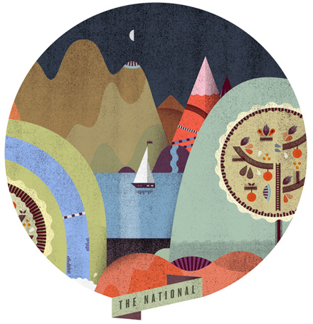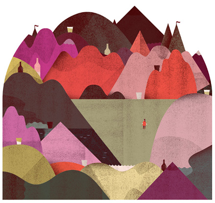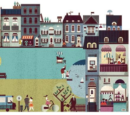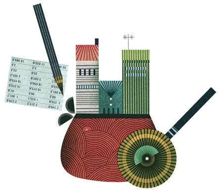


I am enjoying the work of Lotta Nieminen, a graphic designer and illustrator from Helsinki, Finland. I particularly like how she renders buildings and I love her style, which is very infographics-friendly (read: a clean style, pretty icons and – oh! – those cute tiny people!) What Lotta adds to the mix though, are beautiful textures, a beautiful color palette and a consistent style that makes her work stand out.


beautiful!
thanks a lot for posting this.
Wow, I love this work! Thanks Amy for sharing this with us. Your blog is a great incentive to me for staying creative.
I love her usage of textures with her illustrations. I don’t see many illustrators with a similar style. Also love the geometric feel throughout her work as well. Thanks for sharing!
Nice! I really like the texture she puts on her illustrations too.
Wow – I love these – I’ve never seen her work before. I especially like the shapes and colours 🙂
wow, really nice work! So refreshing!